

BRANDING

Golf branding…

Patricia White’s rebrand…

Country Cousins brand refresh…

Logo design…
Country Cousins Brand Refresh
Country Cousins is the longest established introductory live-in care agency in the UK. Because of its reputation, I didn’t want to lose the old logo, so I modified it in a way to offer us maximum flexibility when designing communications and refreshed the overall identity to create a stronger brand position in the care market.
Together with the new logo I produced extensive guidelines to ensure continued consistency across marketing, recruitment, social media, internal and compliance documents. The guidelines laid out our tone of voice, leaf device, a new colour palette and tints, typography guidelines, photography tips and layout principles.


The Castle
Stafford Castle Golf Club changed their name to The Castle in a bid to modernise and I was tasked to update their branding to reflect this.
I created a modern icon based on the original castle (now just ruins) which overlooks the course. This was paired with a wordmark containing small wedge serifs to create a strong character and progressive identity. The branding has been implemented throughout the club to good effect.


Green Haworth
Green Haworth was using a mixture of different logos based on a ram image, but the club wanted to push forward and modernise, but still keep the ram.
Inspired by the LA Rams branding, I wanted to create a striking and powerful identity that totally changed the perception of what a modern golf club could look like. The logo and brand guidelines that I consequently created was one of my favourite projects and allowed me to have a lot of fun in establishing a bold and commanding identity.


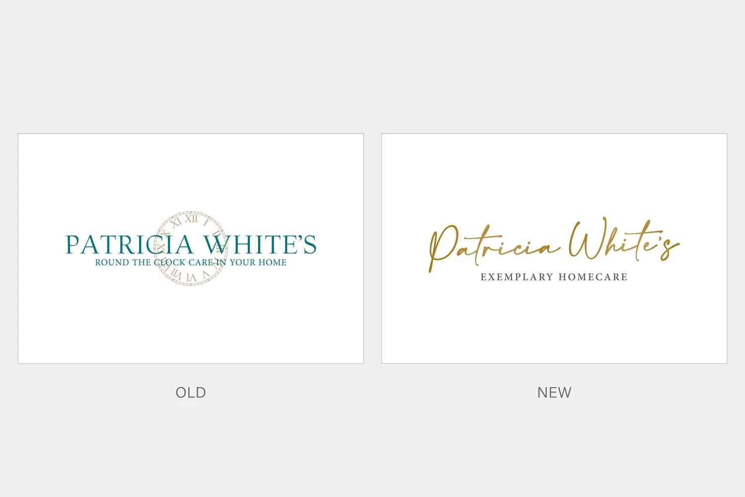
Patricia White’s Rebrand
Patricia White’s is a leading home care provider that prides itself on its high quality, discrete and prestigious service. The original logo was outdated, difficult to use across promotional items & online and lacked the sophistication the company wanted to portray.
I proposed a total overhaul of the brand… created a new logo and icon mark, defined the image style and introduced an illustration design, I outlined the typography and a new colour palette, plus refining the tone of voice for the company. The result was an in-depth brand guidelines, which set a precedent for ongoing marketing collateral and internal communications.
The idea for the logo was to be modern, but ready to stand the test of time, with a personal touch and reflect the high quality service the company offered.


Logo Design
Gigastack - a government-funded project which will be demonstrating the large-scale (gigawatt) production of zero-carbon hydrogen using offshore wind energy.


OYSTER - a project which demonstrates and investigates a combined wind turbine and electrolyser system designed for operation in marine environments.


A collection of logo design projects


